The Problem with Charts and Graphs Politics
Why the GOP’s message machine keeps winning while Democrats keep measuring the weather

The American right doesn’t just message - it creates meaning.
What used to be a political party has become a 24/7 content engine, an ecosystem that functions less like journalism and more like a rhetorical rock tumbler. Ideas and grievances bounce endlessly through talk radio, YouTube, Telegram, and TikTok until they’re polished smooth enough to pass for truth.
This machine doesn’t aim to inform. It aims to compel. It takes a stray comment from a teacher, a TikTok clip from a protest, a quote from a campus activist - and turns it into a referendum on the entire political left. It’s a system built for feeling, not fact.
And it works.
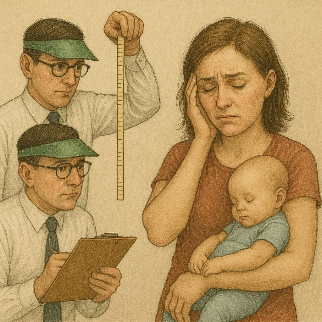
Meanwhile, Democrats are still staring at charts.
This month brought the release of another lengthy assessment of the party’s problems. It offered what it billed as a precise, mathematical roadmap to electoral success. Its thesis was simple: if Democrats moderate their positions to align with public opinion, they’ll win.
To reinforce the point, the report includes a glut of charts, tables, and graphs - an avalanche of arrows and axes meant to prove that the data confirm the diagnosis. But the visuals don’t always match the narrative. The charts suggest complexity; the conclusions demand simplicity.
Still, that mismatch isn’t the real problem. The deeper problem is the worldview behind it - the idea that politics can be reduced to math. That if we just tweak our position two degrees to the right of the median voter, the numbers will fall into place.
It’s the triumph of Excel over experience.
The “Charts and Graphs” Mindset
Democrats have become addicted to dashboards - believing that every political question has a data-driven answer if we can just find the right chart. Polls, cross-tabs, persuasion models, trend lines - all the visual comfort food of the professional class.
But charts and graphs are the language of observation, not connection. They describe outcomes, not motivations. They tell us what people say they believe, not what makes them belong.
Politics isn’t a spreadsheet problem. It’s a social and emotional one.
Five Ways the Charts Fail Us
1. They mistake measurement for meaning.
Data can show movement; it can’t show why people move. You can graph trust, but you can’t build it with a bar chart. People don’t join a movement because they saw a cross-tab - they join because someone they trust told them a story that made them feel seen.
2. They make us spectators in our own democracy.
Too often our analytics turn campaigns into meteorology: we measure the weather of public opinion but forget that we can change the climate. The right is out there seeding the clouds - shaping perception through relentless repetition. We’re standing on the porch with a clipboard.
3. They feed elite tunnel vision.
Charts comfort the consultant class. They translate messy human experience into something neat and quantifiable. But each dot on a scatterplot represents a worker, a parent, a veteran, a teacher - people who experience politics viscerally, not numerically.
4. They hide the role of power and algorithms.
A chart looks neutral, but it isn’t. The data we measure are shaped by systems - from which posts get boosted by TikTok’s algorithm to which communities pollsters even call. Numbers reflect power, not truth.
5. They make us reactive, not generative.
Data dashboards tell us where we are. They can’t tell us how to move hearts. The right wins because it doesn’t just track the audience; it trains the audience. It knows the emotional rhythms of fear and belonging. It doesn’t chart public opinion - it rewires it.
A Better Frame: Math + Meaning + Movement
We need data - but data should serve strategy, not substitute for it.
The job isn’t to moderate our positions to fit a graph; it’s to build cultural power strong enough to bend the graph.
Campaigns win not when they find 50 percent + 1 on paper, but when they create a story large enough for people to see themselves inside it. That requires:
Narrative - shared moral meaning.
Network - trusted messengers and creators embedded in community life.
Movement - the ongoing work of turning belonging into power.
In short: fewer dashboards, more doorsteps.
Fewer temperature readings, more people warming each other by the same fire.
“Politics isn’t a spreadsheet problem. It’s a social and emotional one.”
The Real Math Problem
The GOP already knows the math: whoever defines reality wins.
I work with data every day - but until Democrats stop treating politics like a math problem and start treating it like a meaning problem, we’ll keep losing the argument even when the numbers say we should win.
We don’t need another chart to tell us that.
We just need to look up from the graph and talk to someone who’s stopped listening.
h/t to this PBUMP.NET piece which inspired me.
https://www.instagram.com/publicinterestarts/
Art might not be the answer, but it can help